I have designed two typefaces that you can freely use for all purposes under the Open Font Licence (OFL): Cormorant and Ysabeau. Another 11 typefaces are commercially available for licencing. For invented writing systems, check out the Conlangs page.
Free typefaces
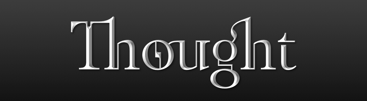
Cormorant is an extremely high-contrast Garamond-style display serif typeface with scandalously small counters and razor-sharp serifs, comprising 9 different visual styles (Roman, Italic, Infant, Infant Italic, Garamond, Garamond Italic, Upright Cursive, Small Caps, and Unicase) and 5 weights (Light, Regular, Medium, SemiBold, and Bold). This is not so much a workhorse as a unicorn of a typeface: Place it center-stage and make it as large as possible, and it will shine. The Cormorant webfonts are served over a hundred million times each week from Google Fonts, and you can find the print versions on the covers of books and on shopfronts in the wild.
Download Cormorant either from Google Fonts or from its GitHub repository. For a detailed and illustrated presentation of Cormorant, check out its Bēhance page.
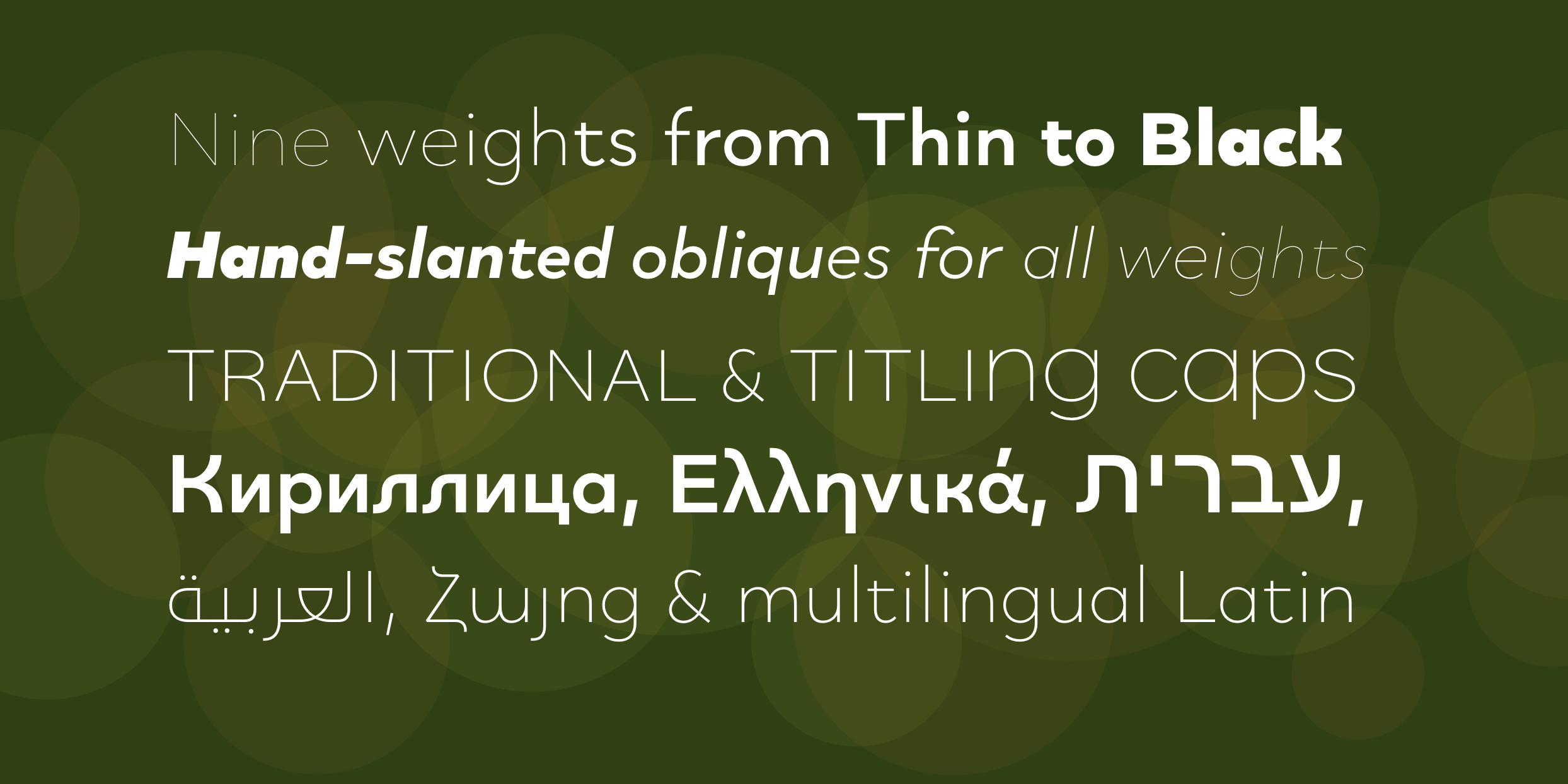
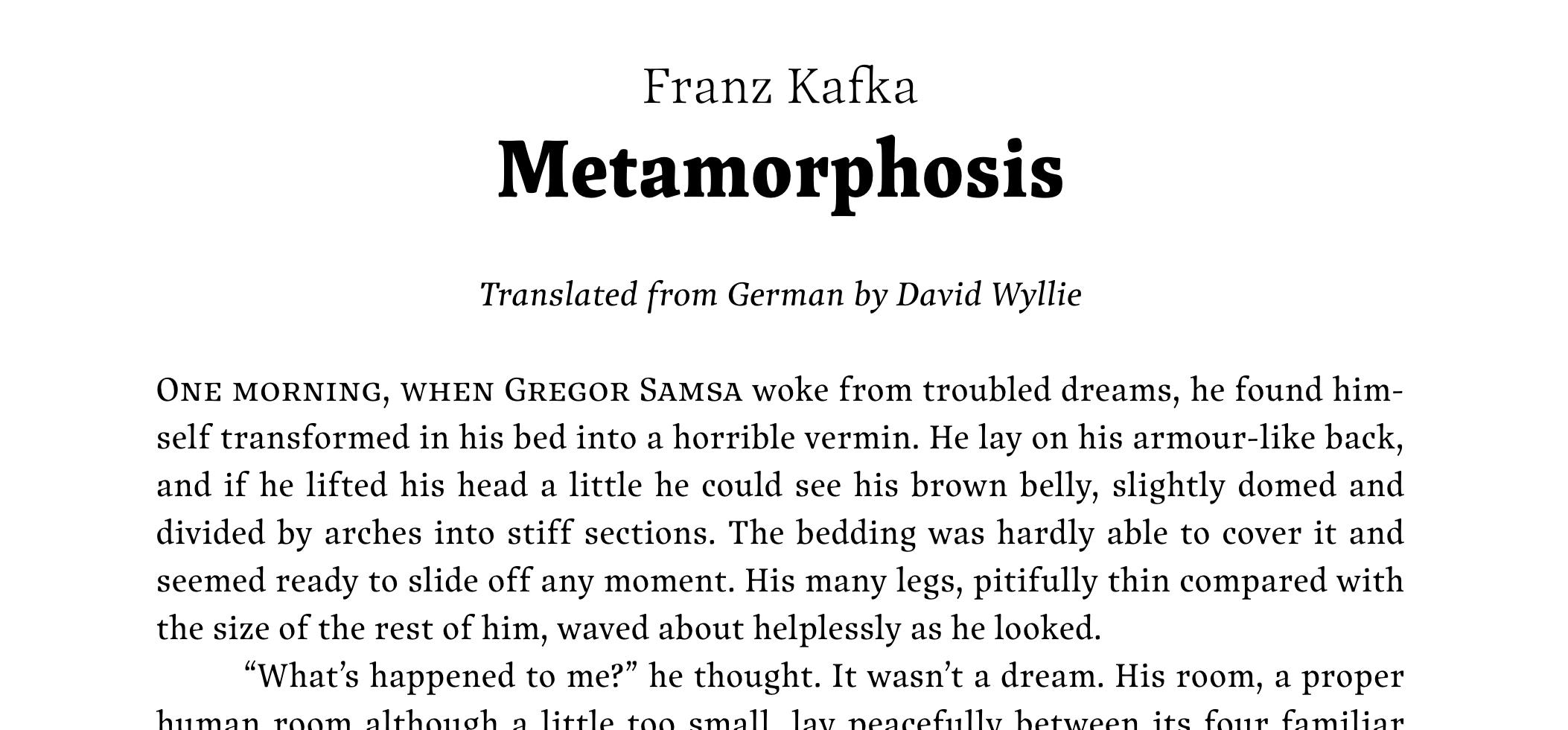
Ysabeau is a contemporary humanist sans designed to serve as the sans counterpart to the world’s favorite reading typeface, Garamond. Unlike most sans typefaces, it closely follows Garamond’s beloved and time-honored proportions, including its generous stride and tall extenders, which renders it supremely readable for running text. In fact, you are reading it right now! Try it on your favorite e-book reader and never look back. The Ysabeau family comprises 7 different visual styles (Roman, Italic, Infant, Infant Italic, Office, Office Italic, and Small Caps) and 12 weights (Hairline to ExtraBlack) and supports Adobe Latin 4, Кириллица, ϗ Ελληνικά.
Download Ysabeau either from Google Fonts or from its GitHub repository.
The following typefaces of mine are not free but can be licenced from FontSpring or MyFonts. I'm happy to offer you special rates for non-profit uses. You can find a detailed and illustrated presentation of some these typefaces on Bēhance. Short descriptions follow below.
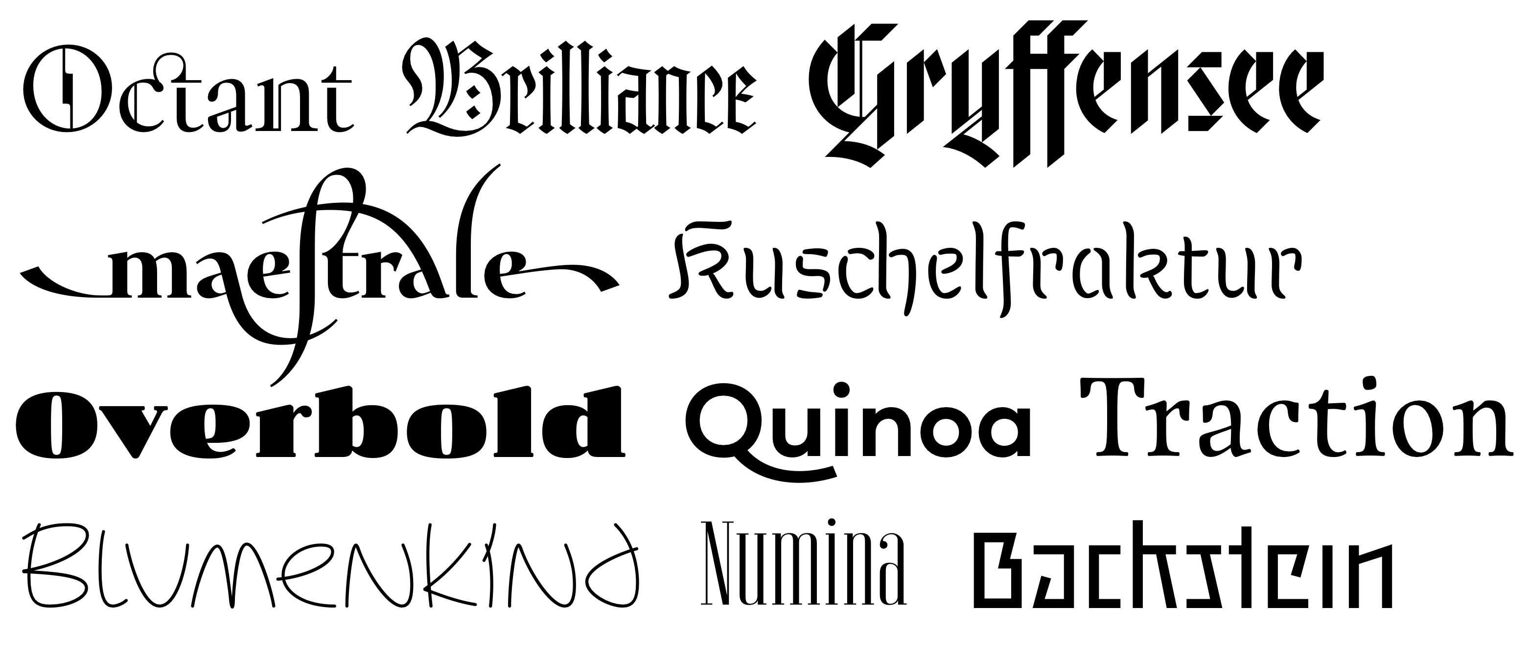
Octant is a steampunk serif font and my earliest commercial release. After all these years, it’s still one of my most original designs.
Quinoa is a highly versatile warm geometric sans covering Latin, Cyrillic, Greek, Arabic, Hebrew, and even Armenian. It is my best-selling product by a large margin.
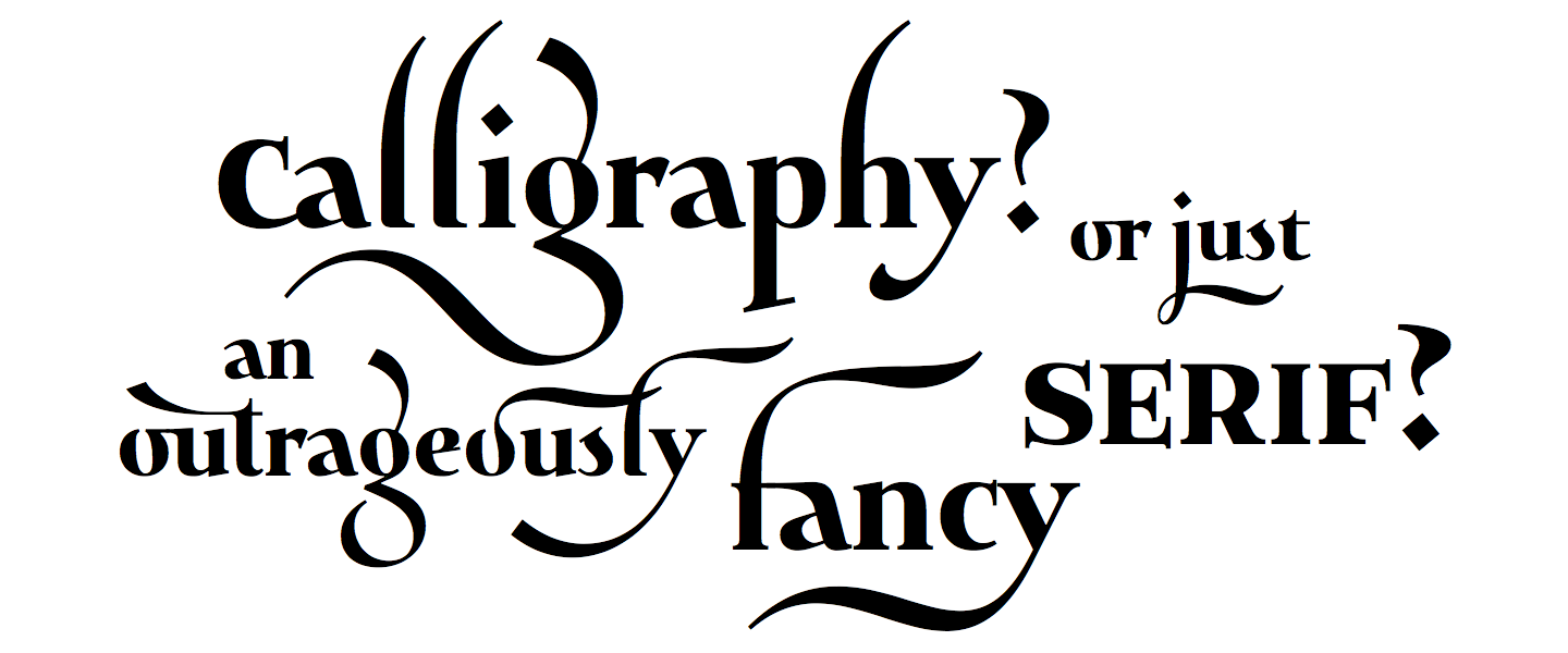
Maestrale is a calligraphic font built like a yoga instructor: A powerful compact core and long, flowing limbs.
Overbold is a jolly display font originally inspired by an illustration by Eric Gill on how not to draw bold letters. I'm having so much fun with it.
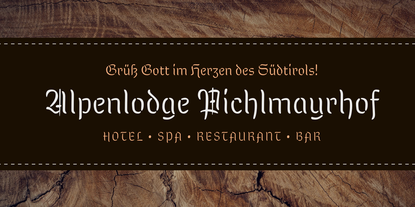
Kuschelfraktur is a warm and friendly take on blackletter, based on my experimentation with a brush pen.
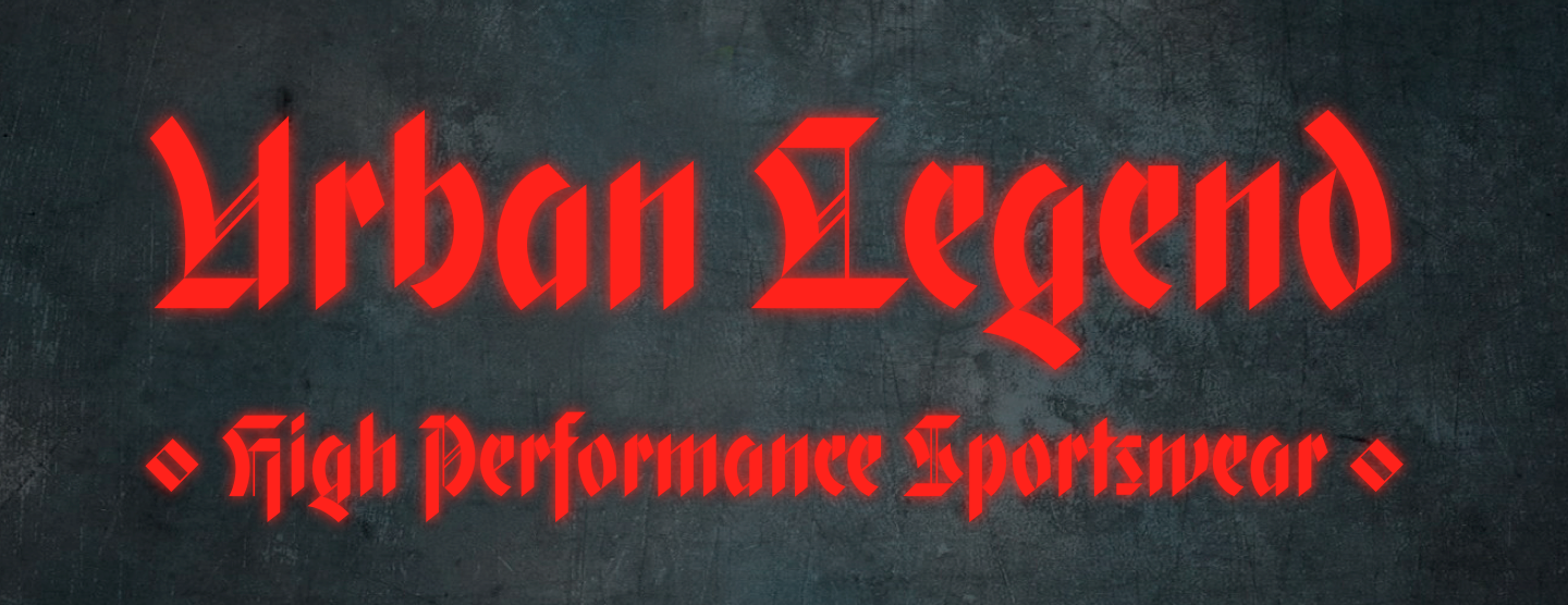
Gryffensee the opposite: A starkly contrasted, geometric interpretation of blackletter.
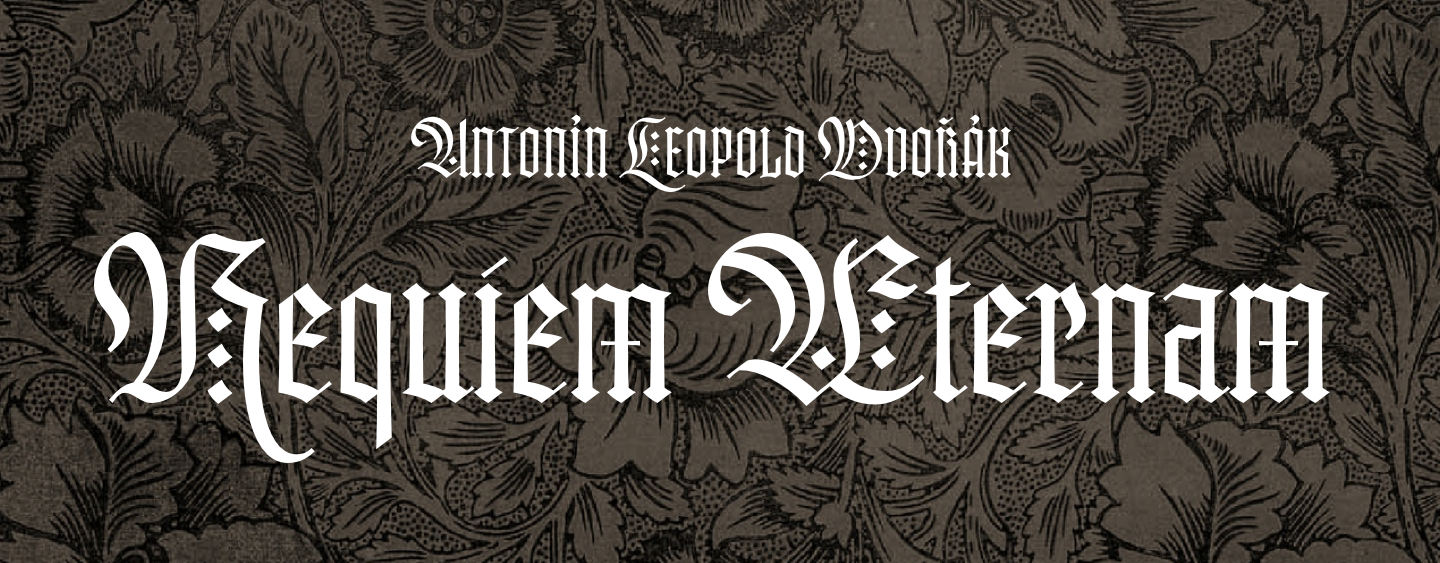
Brilliance is a textura-style blackletter that I developed while experimenting with large letters while writing with a comparatively narrow parallel pen, which is why the capitals employ doubled-up strokes to fill their interior space.
Traction is a rugged organic humanist serif with grip and bite. I like to compare its aesthetics to a ladies’ hiking boot — built for traction first and foremost, yet elegant. I designed the first, basic version of Traction by myself, and Schriftlabor completed and produced it, which is why it is distributed under their banner on FontSpring and MyFonts. It's best to licence it directly from their website though.