For many centuries, the letter ß (eszett or sharp s) has been a unique part of German orthography. Although sometimes confused with B or β (beta) by foreigners, it is in fact a type of s, based off the historical long ſ. The three words Rose, Rosse, and Große illustrate the need for it: The latter is pronounced with the sharp (unvoiced) s sound of Rosse while preserving the long o of Rose.
Until very recently, the letter did not officially have a capital form, since it never occurs at the beginning of a word. In all-capital settings, the makeshift replacements SZ and SS were supposed to be used instead, although there was a long history of people coming up with homebrewed capital eszetts in both handwriting and print. In 2008, the capital eszett ẞ was finally added to Unicode, and in 2017, it was officially adopted into the German orthography (cf. Wikipedia).
At first, many type designers were at a loss as to how to draw the new letter, given its novelty. It didn't help that a number of pre-existing typefaces received hastily-made updates to stop the gap, with capital eszetts ranging from the shoddy to the downright unusable. While things are looking much better nowadays, we are still in the exciting phase where the clay hasn't hardened yet, where each new design contributes to the corpus of precedent and best practice on which future typefaces will be built. We, the type design community, have a hand in deciding how pretty this new letter will be in the long run. Let's make the most of it!
In order to work properly, a capital eszett must fulfill the following duties:
It must be recognizable at first sight as an eszett to native readers, even to those only familiar with the lowercase form;
Conversely, it must not look like anything else, particularly not a B;
It must fit in naturally amongst other capital letters.
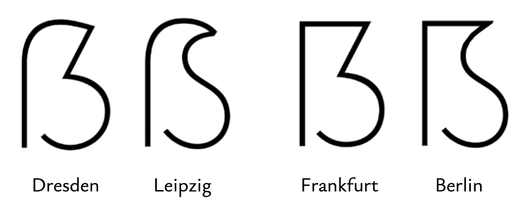
For most typefaces, this will lead to a design somewhere within the parameter space between the following four archetypes (→ Fig. 1). Andreas Stötzner, the father of the modern capital eszett, proposed the Dresden and Leipzig designs, which Adam Twardoch countered with the Frankfurt and Berlin designs:
Fig. 1: The old taxonomy based on city names. (Graphics: Nick Shinn)
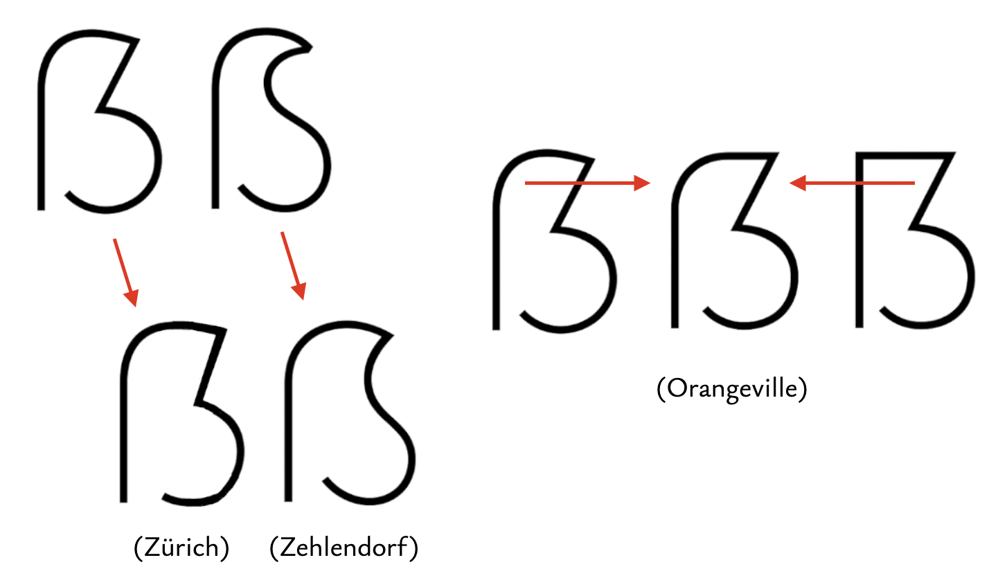
It quickly became apparent that finer distinctions were necessary. When the German government's custom typeface BundesSans raised eyebrows with its Leipzig design of particularly fetching proportions, that design was dubbed Zehlendorf. I found my own favorite design (spoiler alert!) when applying the same fetching proportions to the Dresden model, and named it Zürich for future reference. Meanwhile, Nick Shinn found particular interest in Dresdens with a plateau in the top right, and named those Orangeville (→ Fig. 2).
Fig. 2: Subtypes of the Dresden and Leipzig schools named after even more cities.
But throwing around ever more city names can hardly be the solution, opaque as they are for newcomers and veterans alike. Allow me, therefore, to propose…
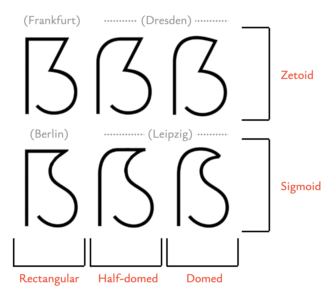
I propose to use transparent and descriptive terms for the different features of a capital eszett, as opposed to arbitrary monikers. The main two primary areas of concerns are:
The roof, which can be rectangular, half-domed, or domed; and
The bite (right-hand structure), which can be either zetoid (Z-shaped) or sigmoid (S-shaped).
Fig. 3: The new and improved taxonomy based on actual observable features!
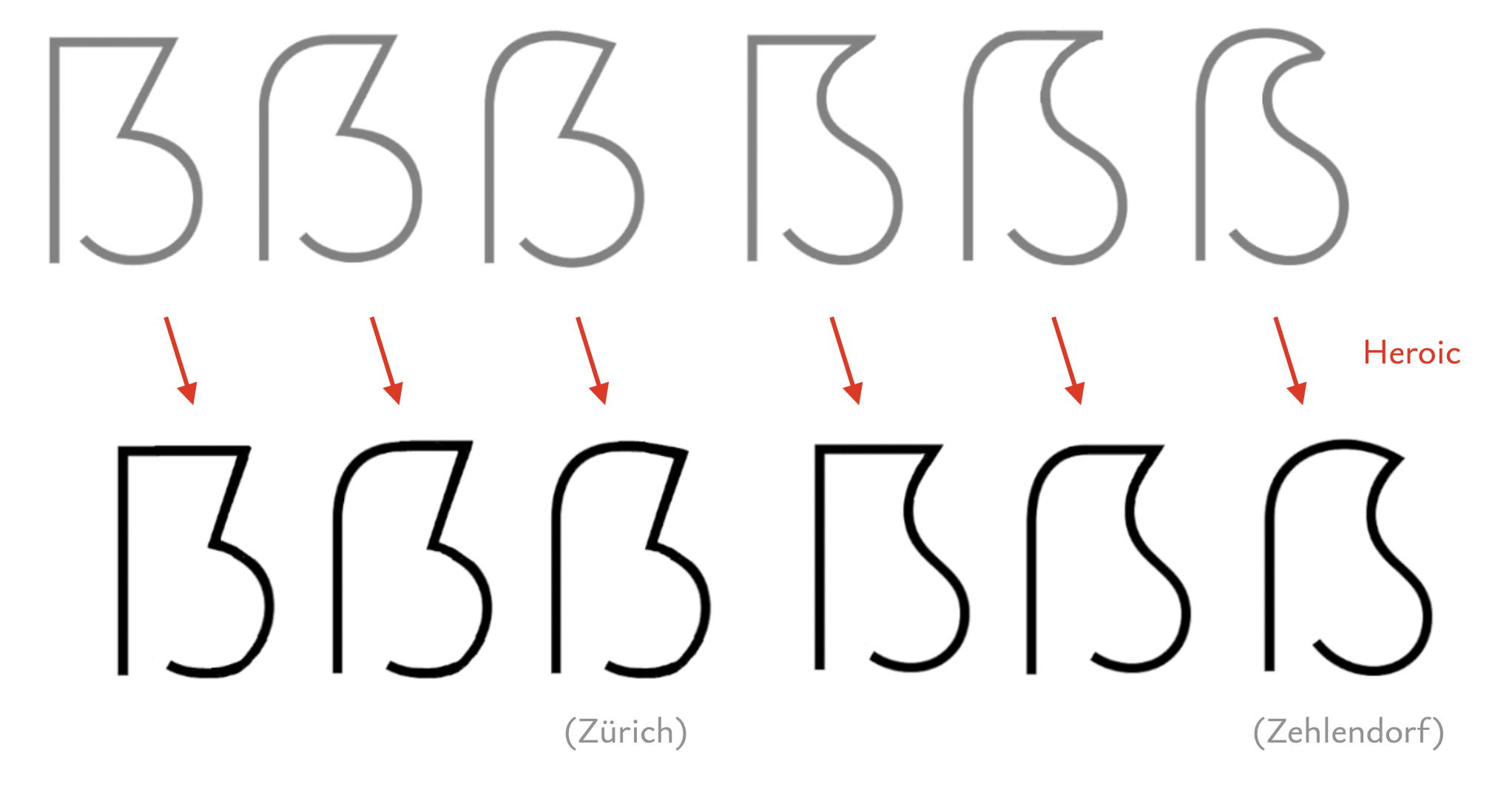
So what about Zehlendorf and Zürich? Well, those are not really additional archetypes, but just a particular set of proportions applied to existing archetypes. As it turns out, you can apply those proportions to all archetypes. It's difficult to put the exact nature of those proportions into a single word, but I've decided to call it heroic — they stand tall and proud, with puffed-out chests. As you can probably guess by now, heroic proportions will form the core of what I consider a successful eszett design. I will go into more detail in the next chapter.
Fig. 4: Any of the base designs can be turned heroic with the right proportions.
This is a highly subjective matter. In principle, all of the designs above are viable and functional when executed properly, and have their share of advocates. The following is my personal opinion and should be taken with a grain of salt.
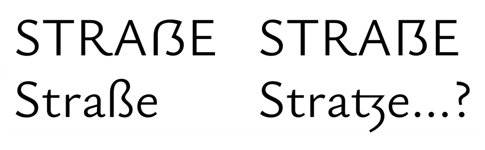
Proponents of rectangular roofs (Frankfurt, Berlin) claim that those better establish the capital nature of the letter, but they do this at the cost of decreased legibility. I find the looped ascender of the lowercase its most striking feature, and the domed and half-domed designs of the capital version reflect that heritage. Conversely, my brain insist on parsing the rectangular ẞ as a TZ ligature:
Fig. 5: To me, a rectangular roof on ẞ suggests a TZ-ligature.
I will freely admit that rectangular roofs are easier to design than domes — in type design just as in architecture. Rectangular eszetts are the brutalist concrete blocks of type design: They have their applications, but they are hardly a universal solution to building houses.
Half-dome roofs seem to promise the benefits of both domes and rectangular roofs. In practice, though, I often find them too sterile-looking for the humanist typefaces that I favor. For a technical-minded font, or one with straight-sided O (such as DIN), it's likely a fitting solution. Look out for the thorn illusion, though: The top right corner of a half-dome will often appear to jut upwards, even though it's mathematically flat. You might even want to introduce a slight downward curvature to counteract the impression.
As for the bite: I find that sigmoids often make fussy, overly decorative, or downright goofy impressions. Most «serious» typefaces are better served with a clean zetoid. BundesSans with its disarming Zehlendorf design offers a notable counterexample, though.
Bottom line: Pick what feels right for your typeface. When in doubt, a domed zetoid (Dresden) is a safe bet, but be prepared to put in some labor to make it work.
But what about venturing outside the limits of the parameter space discussed above? I won't deny that there are viable designs to be found there. However, they require a lot of finesse and tact to pull off, and are almost always linked to a special style of typeface.
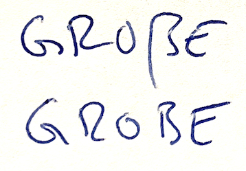
For instance, I don't generally recommend a descender in capital eszetts, but I find it pretty much mandatory in rapid handwriting, since all other features that would distinguish it from B tend to erode away in the medium:
Fig. 6: The words GROẞE and GROBE in my incredibly sloppy handwriting.
By extension, typefaces with uncial or glyphic flavors can get away with more adventurous eszetts, just as they can for other letters. But it would far exceed the scope of this guide to delve into that unbounded possibility space.
Bottom line: If you want to stray beyond the archetypes, better know what you're doing.
Even with a viable skeleton, a shoddy execution can still completely ruin an eszett. Here's how not to botch it. I will illustrate the process on the example of the domed sigmoid (Dresden), but it should be applicable to all archetypes.
3.1. Heroic proportions
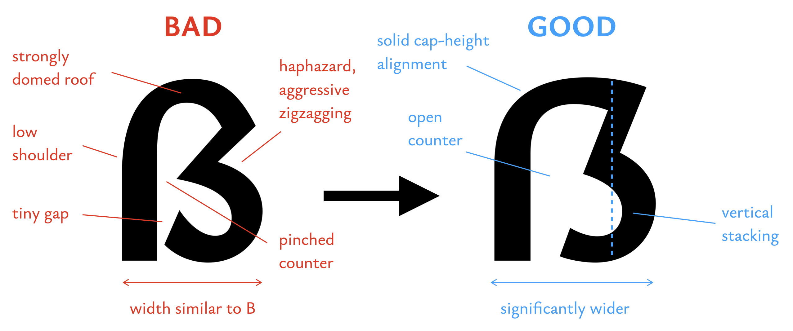
Proportions are key to making a beautiful and functional eszett. Here are a number of recommendations for good proportions, which I collectively refer to as heroic:
Fig. 7: An ugly ẞ and its heroic counterpart in direct comparison. The heroic example is taken from my typeface Ysabeau, in which this article is set.
The width must be significantly larger than that of B to set it apart from the latter. A certain heft is integral to the character's identity, given its complexity and history as a ligature. I used to be rather extreme in this opinion, but have since mellowed a bit. Still, I almost never see any overly wide eszetts, but overly narrow ones are commonplace.
The roof must align well with the capital height. Domes need generous overshoot. Furthermore, the dome's curvature should be shallow so as to «inhabit» the capital height assertively. To that end, the dome's departure from the vertical stem should start high up, and the top right corner should also be high.
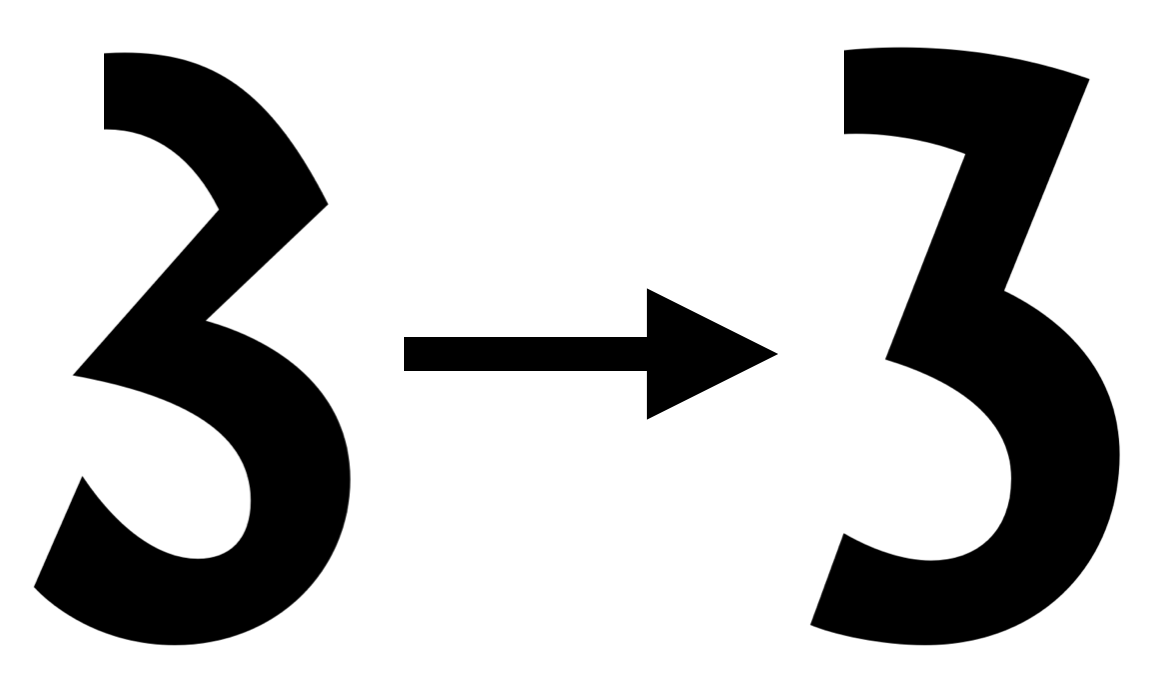
The bite must form a structurally sound support column for the roof. For that, its strokes must be well aligned along the vertical, and their horizontal motions must be kept modest. Think of the fundamental shape of the eszett not as a kind of B, but as triumphal arch. This is the trickiest part of the letter to get right. I recommend looking at the right half of the eszett in isolation (→ Fig. 8)
The counter must be spacious and open to the bottom; this is also an important feature of the eszett's identity (cf. lowercase). Compare its interior space to U rather than B.
Fig. 8: The bite of a heroic eszett should form a balanced and pleasant shape in and of itself, comparable to a flat-topped figure 3.
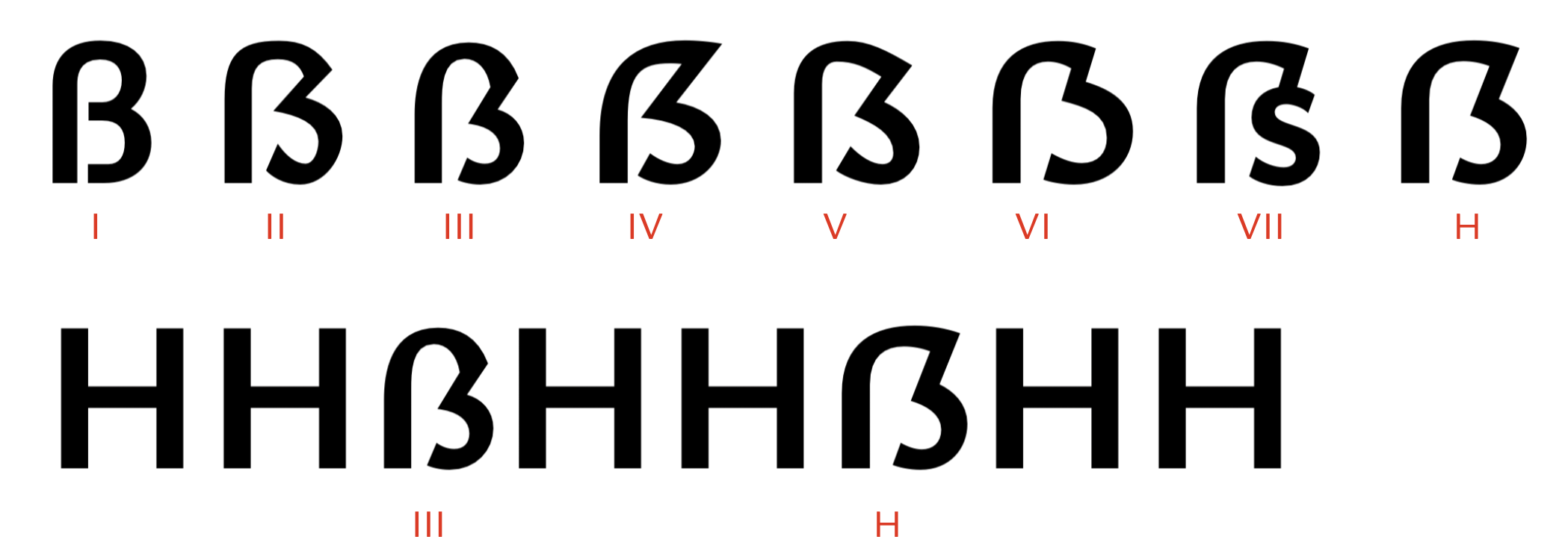
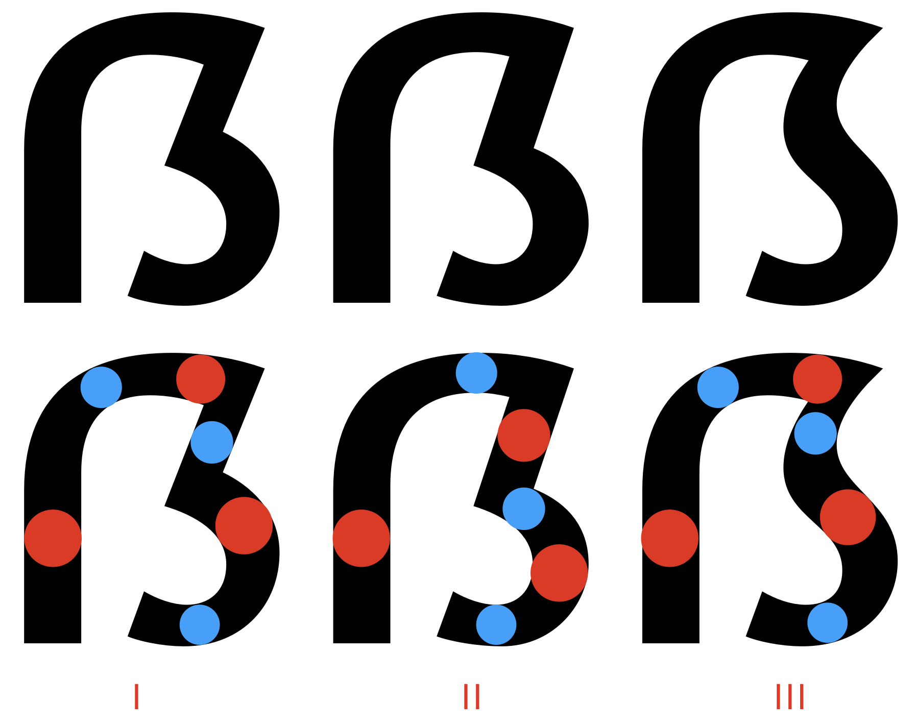
I've noticed some systematicity among the questionable eszett designs I've come across, and I decided to give them names for easier reference:
Fig. 9: A few typical design faults exemplified. I: The Impostor; II: The Quasimodo; III: The Sad Friar; IV: The Clipped Fingernail; V: The Slippery Slope; VI: The Potbelly; VII: The Smartypants. H: The heroic eszett for comparison.
I: The Impostor. Congratulations, you've drawn a B. Structure-wise, this is a lowercase ß trying to buy a beer with a fake license — something you can only get away with in a unicase typeface. Even worse if you somehow have a hard corner in the top left.
II: The Quasimodo. This one is just really badly drawn. Full of lumps and bumps, it looks like it was put together from half a dozen pieces from different fonts. It's not uncommon to find butt-ugly eszetts in otherwise well-drawn typefaces... but please, if you're going through the effort of drawing a capital eszett for your typeface, give it due diligence.
III: The Sad Friar has a shiny bald dome protruding from the crown of its head, and spends his life in a humble hunch. The dome is too feeble to mark a proper presence at the capital height (see bottom row in Fig. 9), and this is often exacerbated by insufficient overshoot or even being outright shorter than capital height (!). This is the sort of thing that radicalizes people into advocating rectangular roofs... Also note that the disproportionate dome makes the right-hand side of the glyph more complicated than needed.
IV: The Clipped Fingernail. Here, the roof is dominated by an incredibly bold sweep of the rising diagonal, leaving a white gap in its top left, which is unduly eyecatching in running text. Furthermore, the extreme bite almost severs off the top part of the glyph, leaving a tiny misshapen counter wedged between two uncomfortably close strokes. This looks even worse if the bite's diagonal is heavy (which is an otherwise legitimate choice, see below).
V: The Slippery Slope heavily favors the downward diagonal. While this is not a bad shape per se, it tends to look informal and sleazy in an otherwise serious typeface. In a sufficiently informal typeface (say, in a graffiti font), you could absolutely get away with this.
VI: The Potbelly disproportionately favors one half of the counter over the other, leaving the right-hand edge uneven. Again, this can certainly work under the right circumstances (say, a bubbly display typeface), but will draw the wrong kind of attention in a text typeface.
VII: The Smartypants is often drawn by people who dislike the official design of the capital eszett and figure their own idea is superior. While you might be able to pull off this sort of thing in a piquant logo, it has no place in anything that expects to be read. The Smartypants comes in a wide variety of forms and shapes, but is generally too smart for its own good. The eszett is not your personal canvas, it is meant to be used by a target audience of 100,000,000+ people. You will have to rein in your ego a bit.
In a contrasted typeface, the capital eszett will have to follow the expected back and forth between heavy and light strokes to look good (my thanks to Andreas Stötzner for making me aware of this issue!). Given the complex nature of the glyph, this can be surprisingly challenging to solve.
In a zetoid eszett, the Z-like diagonal can be either heavy (as in most upright Zs) or light (as the diagonal's orientation would normally suggest). Both are viable choices, as Fig. 10 shows. A heavy diagonal is pretty much mandatory in typefaces with vertical stress, as well as for rectangular roofs, since both demand that the roof be light. Note that for the thin diagonal, the roof needs to grow in weight as it approaches the diagonal, which is tricky to fit into the small amount of available space. For the thick diagonal, it is instead the joint with the lower bowl where it can be difficult to fit in a thin stroke. Avoid joining two light or two heavy strokes, that will look bad.
For a sigmoid eszett, the case is clear. Since its bite is modeled after the S, its spine should be heavy, which corresponds to the thin-diagonal case in zetoids.
Fig. 10: The diagonal in a zetoid can either be light (I) or heavy (II). Sigmoids (III) generally have heavy spines like an S.
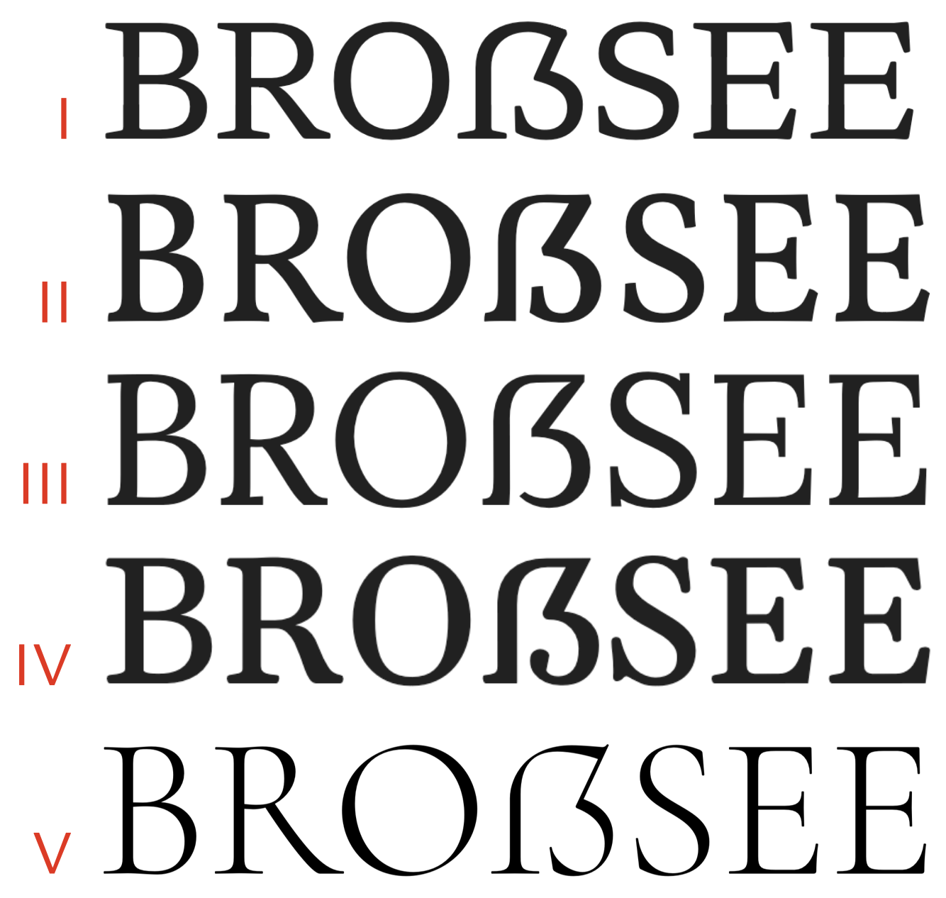
Clearly, a capital eszett in a serif typeface needs serifs. But where to put them? Figure 11 shows up a few options.
Fig. 11: Capital eszetts from the Google Fonts Hahmlet (I), Vollkorn (II), Lora (III), Gelasio (IV), and Cormorant (V). Note the different serif placements.
The vertical left stem needs a serifed foot at the bottom. This can be the same type of treatment as in the feet of H, but as Luc(as) de Groot points out in his excellent article on the eszett, many type designers omit the serif on the stem's right side such as to avoid diminishing the all-important bottom gap. This is shown in the examples II–IV above.
The terminal of the bowl to the bottom right is typically treated the same way as the corresponding terminal in S, given the obvious relation. Example III shows that it can also be simplified, again to avoid crowding around the gap. In transitional and modern designs, a ball terminal may take the place of the serif (Example IV).
In rare cases, a serif can be found on the top right corner. This is the case for my Cormorant (Example V), which in general exhibits unusually long and sharp serifs (GitHub user Orthoxerox dubbed the style «Victorian stainless steel murderspider»), so a plain corner felt out of character there. It can snag the eye if overdone, so use it with caution. Vollkorn (Example II) cunningly implies that serif with a mere bulging of the roof stroke at the corner.
I'll be looking at examples from the Google Fonts catalog, as well as a few select retail fonts. These are my subjective opinions, to be taken with a grain of salt. If you'd like to see more examples of good designs, R::bert collects them here on Typografie.info (in German).
4.1. Great
FF Ernestine's capital eszett is bright, proud, unapologetic, and perfectly attuned to the typeface's character:
FF Ernestine by Nina Stössinger
Roboto Slab goes all-in on the steel girder aesthetic, and this rectangular roof design fits like a glove.
Roboto Slab by Christian Robertson
Ulrike Rausch's brilliant hand-lettered fonts feature fittingly excellent capital eszetts closely adapted to the typeface's character.
LiebeRuth, LiebeDoris, and LiebeDoni by Ulrike Rausch
Yrsa's capital eszett is solid all around. The gap could be a hair wider, and the stress distribution around the upper right corner is a bit fuzzy, but I won't complain.
Yrsa by Rosetta et al.
BioRhyme's capital eszett is weird and funky in so many ways: Slippery slope design, extreme eye-snagging serif up top, complicated internal serif... and yet, against all odds, inexplicably, it works. Amazing. A tale of typographic courage.
BioRhyme by Aoife Mooney
Bellefair's capital eszett is clean, elegant, and heroic.
Bellefair by Nick Shinn and Liron Lavi Turkenic
Wayfinding Sans features a capital eszett with absolutely perfect heroic proportions. The choice of semidomed roof works very well for the clean and technical character of the typeface.
Wayfinding Sans by Ralf Hermann and Sebastian Nagel
Tabac Glam showcases a veritable gem of a high-contrast capital eszett. Top shelf.
Tabac Glam G4 by Tomáš Brousil
Canapé's capital eszett is pure joy.
Canapé by Sebastian Nagel
I apologize for the vanity, but I do think my Ysabeau's capital eszett (which I used as my poster child for heroic proportions) makes for a good example. It does owe a lot of its beauty to Andreas Stötzner, whom I hired to review the typeface. I had problematic stress distribution before Andreas pointed it out to me.
Ysabeau by Christian Thalmann
Most blackletters are not fit for all-cap use, but Varna is up to the challenge. All the better, then, that it has a very convincing capital eszett.
Varna by Eimantas Paškonis
Despite its high level of abstraction, VTG Stencil UK No. 76 manages to establish its capital eszett unambiguously and defend it against B with the subtlest of means.
VTG Stencil UK No. 76 by Andreas Seidel
4.2. Problematic
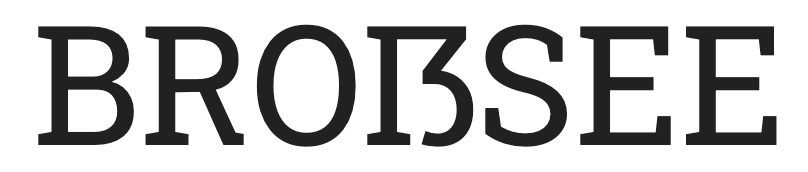
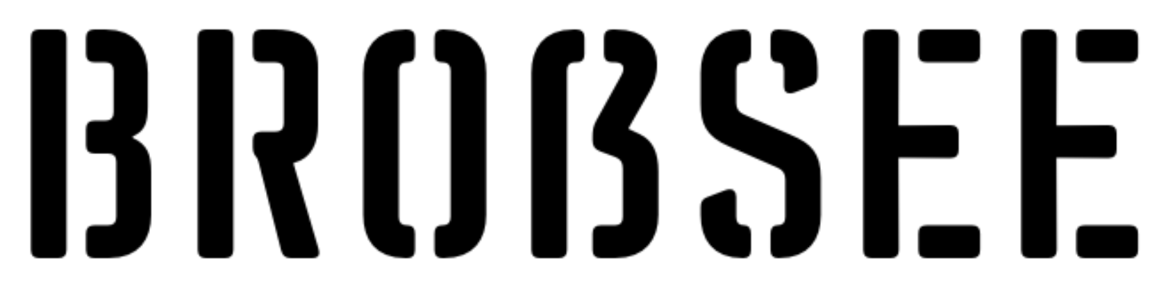
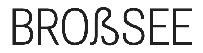
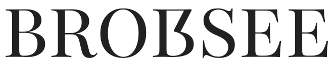
The capital eszett in Open Sans does not live up to the typeface's high standards. The gap is much too narrow (BROBSEE?), the bite is scrunched up, and the dome is too bulbuous. Not terrible, not great.
Open Sans by Steve Matteson
Neue Helvetica features an impossibly acute angle that snags the eye. I would have expected something more understated from a typeface known for neutrality.
Neue Helvetica by Max Miedinger et al.
EB Garamond falls afoul of the Clipped Fingernail design, and the bottom gap is too narrow. Not too bad overall. (What's with the missing RO kerning, though?)
EB Garamond by Georg Duffner and Octavio Pardo
Playfair Display pays an admirable amount of attention to getting the contrast right, and the ball terminal as a departure from S is a nice touch. However, the gap between the ball terminal and the stem is much too narrow, and the upper counter would profit from making the diagonal steeper.
Playfair Display by Claus Eggers Sørensen
The capital eszett of Source Serif 4 looks very elegant at first sight, but the top right corner is made of two thin strokes connecting, thus breaking stress rules. Once I've seen it, I can't unsee it. It's a tiny detail, though.
Source Serif 4 by Frank Grießhammer
Look, I love Alegreya, but this capital eszett is all kinds of problematic. Way too wide, potbellied, and the corner made of two thin strokes breaks the contrast rules. Bordering on the unusable.
Alegreya by Juan Pablo del Peral et al.
4.3. Unusable
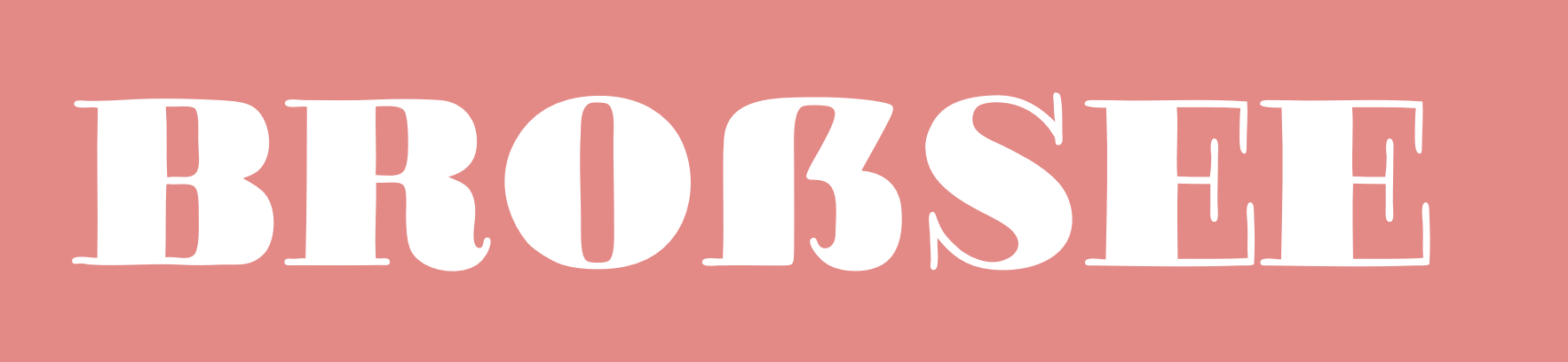
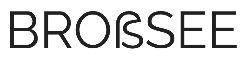
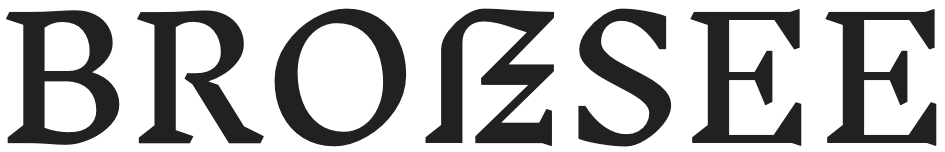
Nunito falls into the Impostor trap. This definitely says BROBSEE.
Nunito by Vernon Adams, Cyreal, Jacques Le Bailly
Et tu, Minion? I'm shocked.
Minion 3 by Robert Slimbach
Raleway's capital eszett smacks of the Smartypants fallacy, with an absurdly emaciated counter at odds with all other letters.
Raleway by Matt McInerney, Pablo Impallari, Rodrigo Fuenzalida
Jost's capital eszett can only be described as a soggy spaghetti.
Jost by Owen Earl
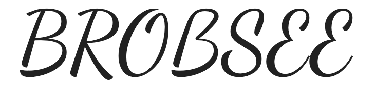
Dancing Script's capital eszett is probably the most shameless example of the Impostor issue I've ever seen. You could replace the B with it and nobody would notice.
Dancing Script by Impallari Type
Roboto Flex has an inexplicably bad «capital» eszett that looks like a (bad) lowercase version, even while its sibling Roboto Slab is up there among the great examples.
Roboto Flex by Font Bureau et al.
The capital eszett in Alumni Sans Inline One is shaped like a lowercase eszett, is too tall, and its sidebearings are off. Please try harder.
Alumni Sans Inline One by Robert Leuschke
Hedvig Letters Serif displays an extreme case of the problem we previously saw in Alegreya: The entire top right of the capital eszett is too thin and breaks stress rules.
Hedvig Letters Serif by Kanon Foundry et al.
Unlike Playfair Display, Playfair sports a completely obscure, unreadable capital eszett. It's admittedly a pretty shape, but it does not fulfill its purpose. Smartypants syndrome.
Playfair by Claus Eggers Sørensen
OK Claus, what are you playing at? This isn't an eszett by any measure. If anything, it's a symbol for «I didn't feel like drawing an eszett». Just rude.